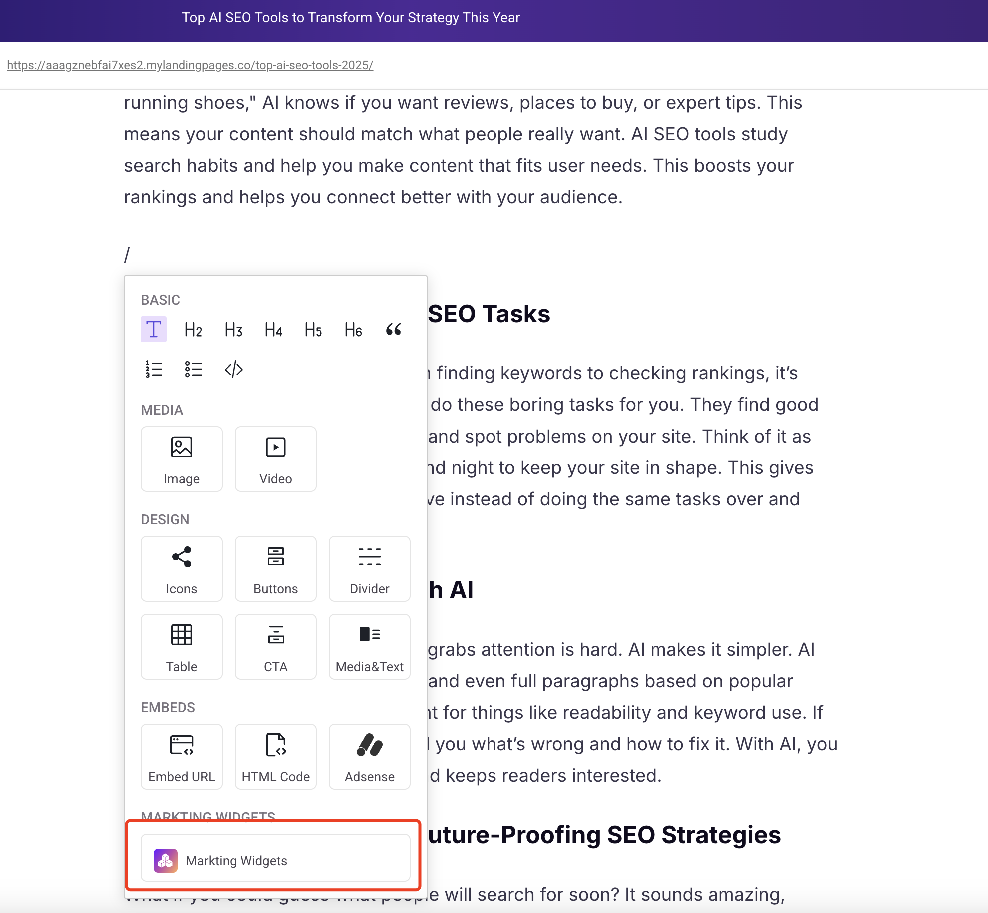
QuickCreator Marketing Widgets
QuickCreator Marketing Widgets is a no-code HTML embed tool specifically designed for digital marketing scenarios. It helps users quickly deploy high-conversion interactive components to boost the effectiveness of content marketing.
This tool seamlessly integrates with our blog writing platform, creating a complete content workflow from creation to publishing to conversion. At the same time, the marketing widgets are compatible with major platforms like WordPress and Shopify, meeting diverse deployment needs.
Get started
Marketing Widgets are currently in beta testing and are available for free to all QuickCreator users. After the testing period ends, you’ll still be able to use the widgets you created during this time.
You can access QuickCreator Marketing Widgets in the following ways:
Direct link: https://app.quickcreator.io/quick-widgets/home
From the blog platform:
Product Homepage Overview
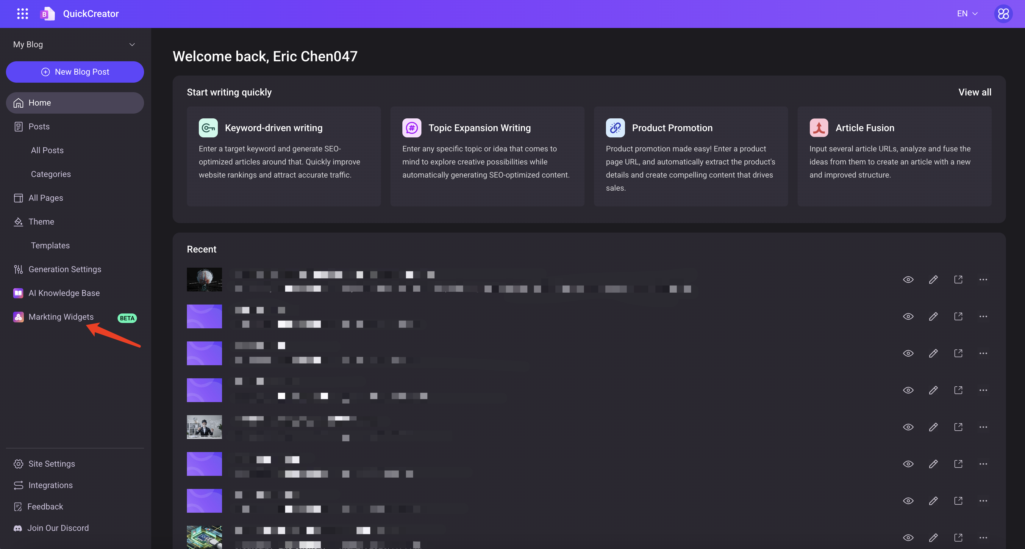
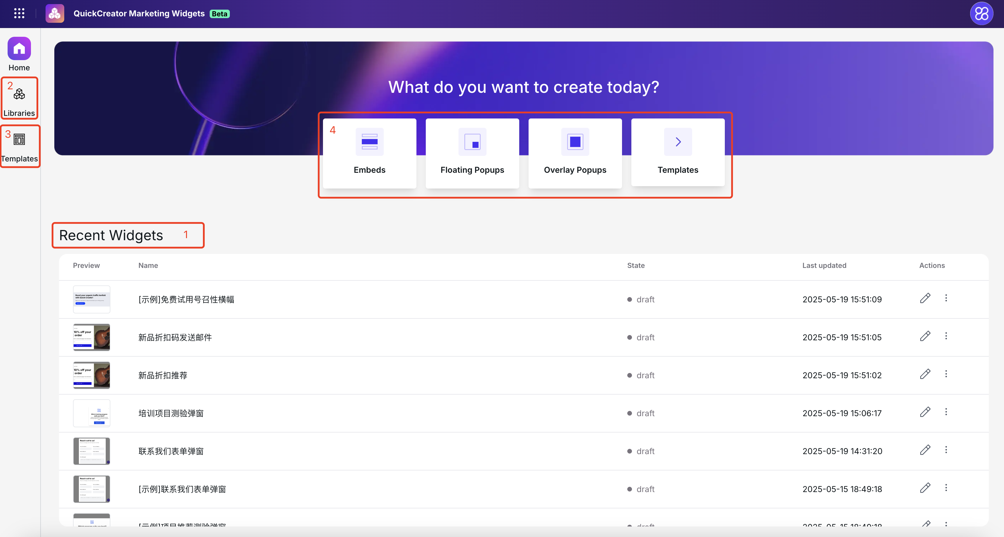
After logging into the system, you'll see the following page:
- This table displays the marketing widgets you’ve recently worked on. New users will see 3 default examples provided by QuickCreator to help you quickly get started.
- In the left-hand menu, click on “Libraries” to view all your created widget libraries. You can create multiple libraries to better manage your widgets — think of them like folders.
- “Templates” are pre-built widget examples provided by QuickCreator. They represent best practices for various marketing scenarios. You can choose a template and make slight adjustments to fit most of your needs.
- This section provides quick access to commonly used widget types.
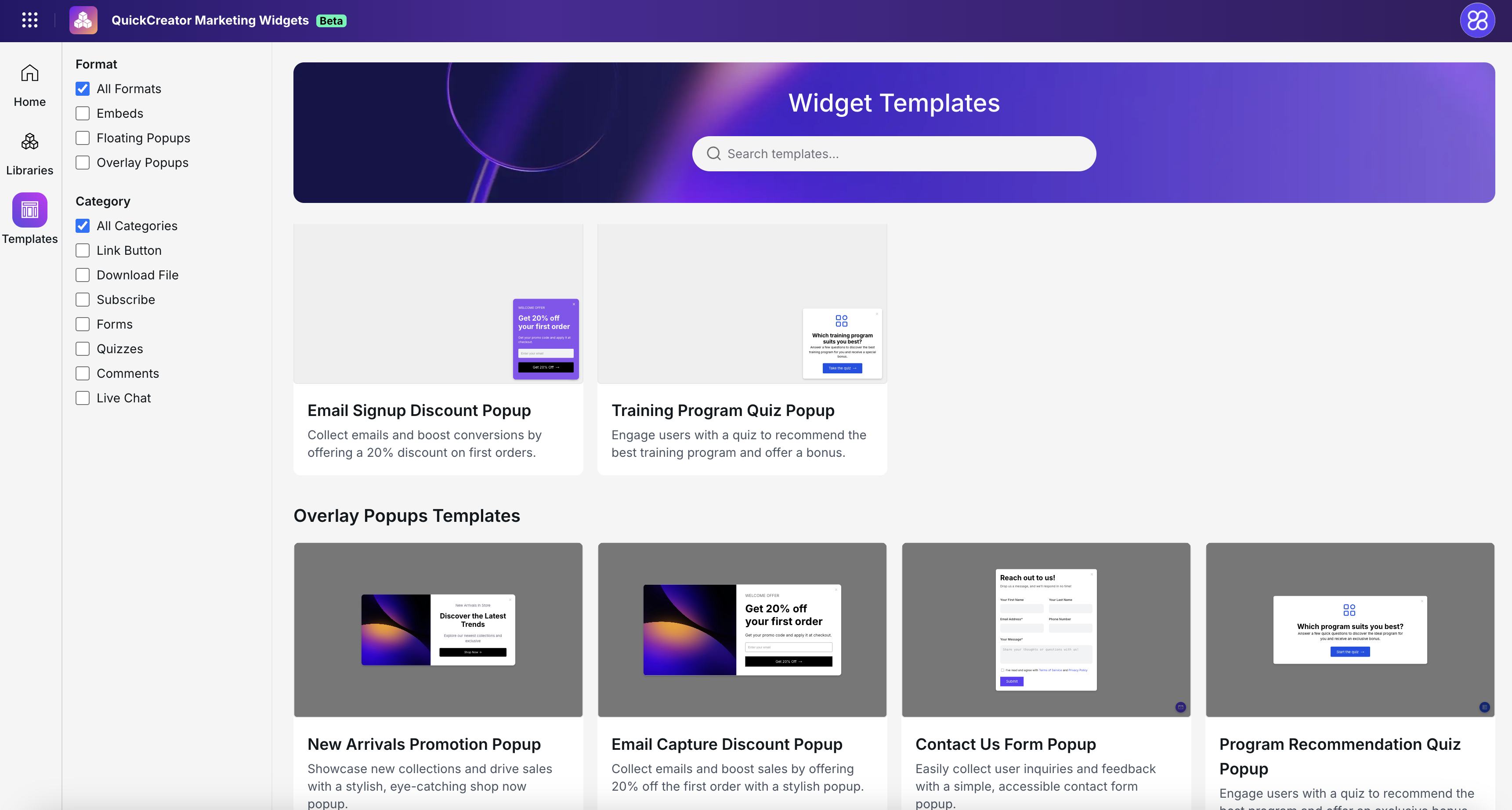
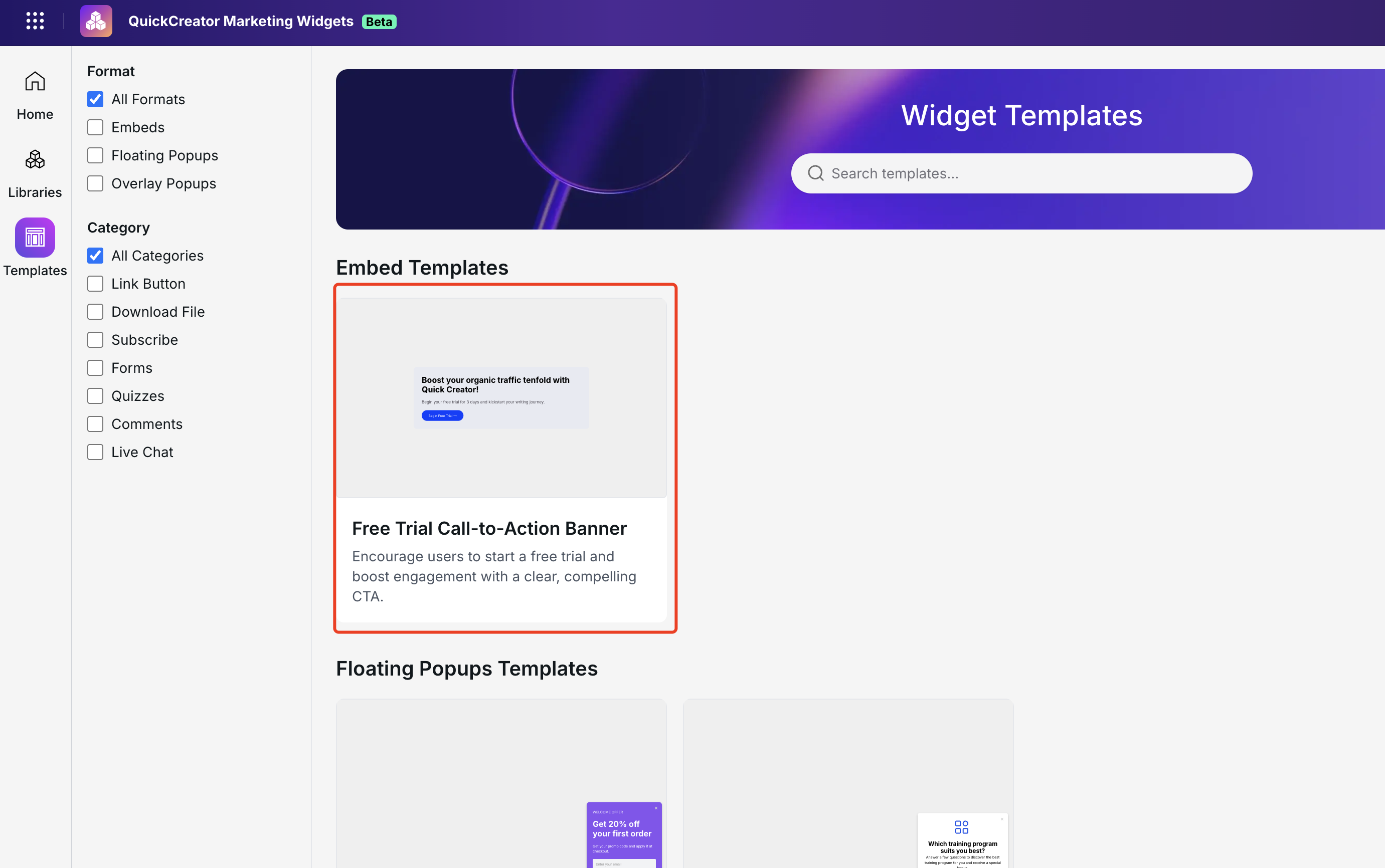
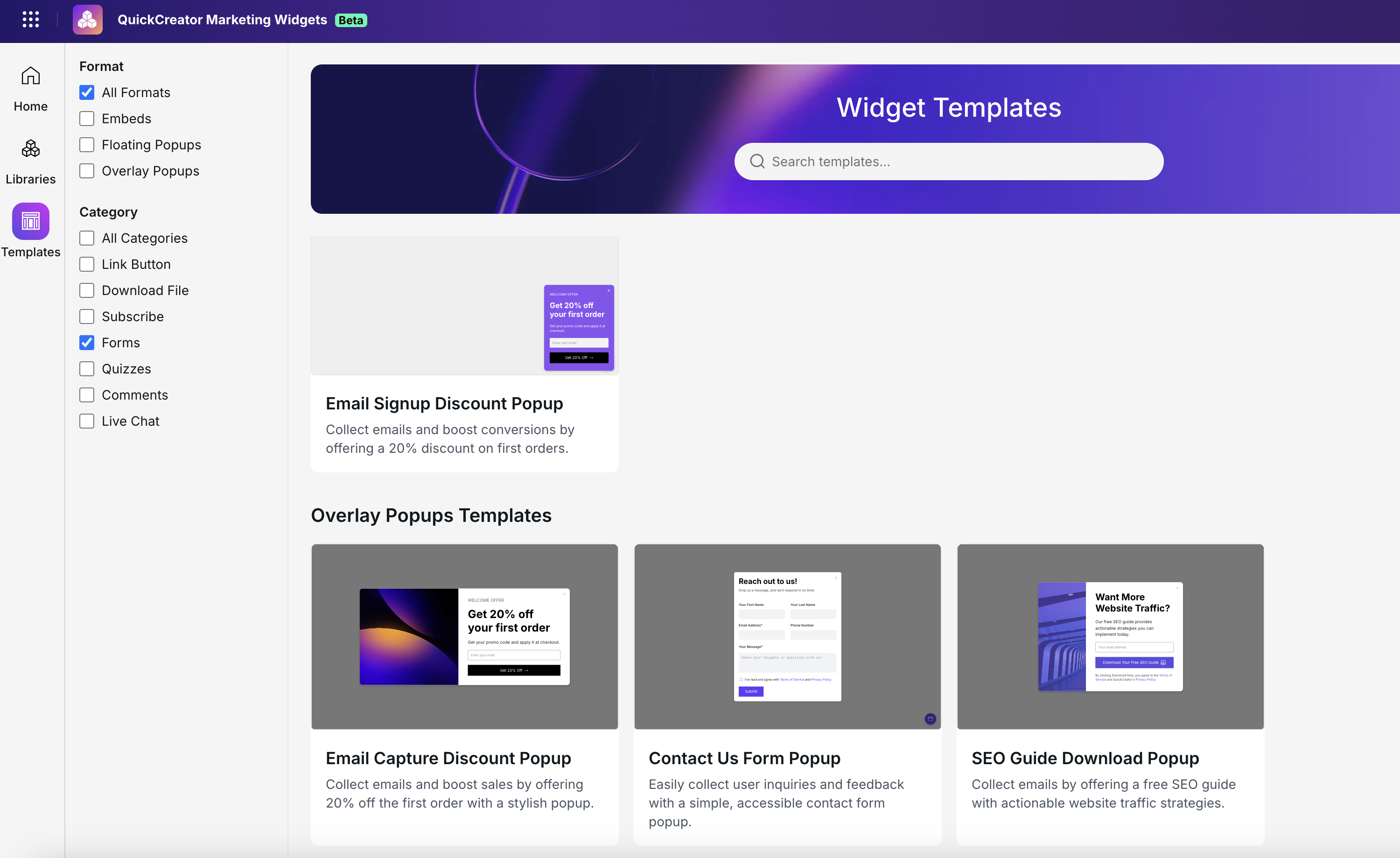
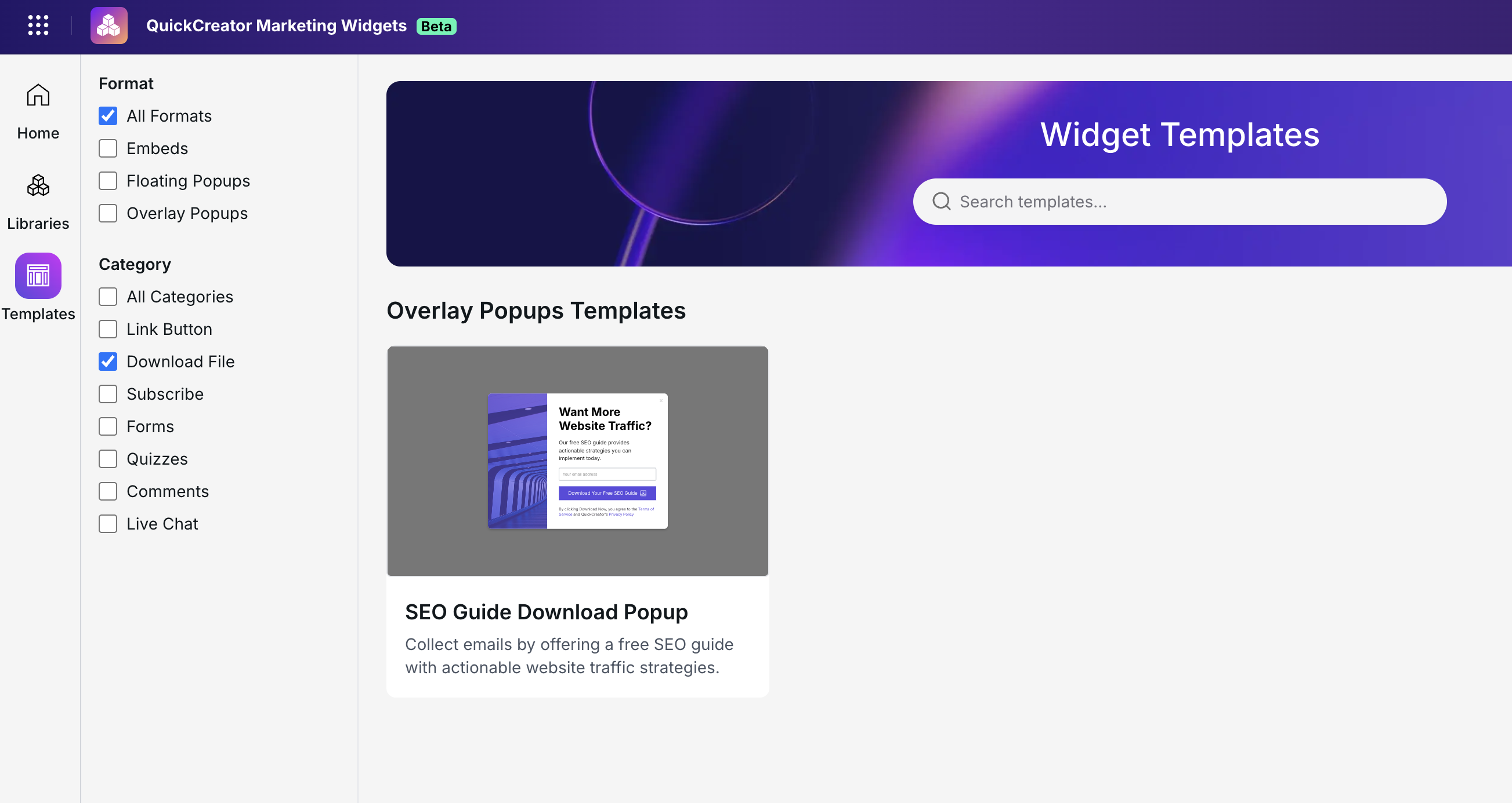
Templates
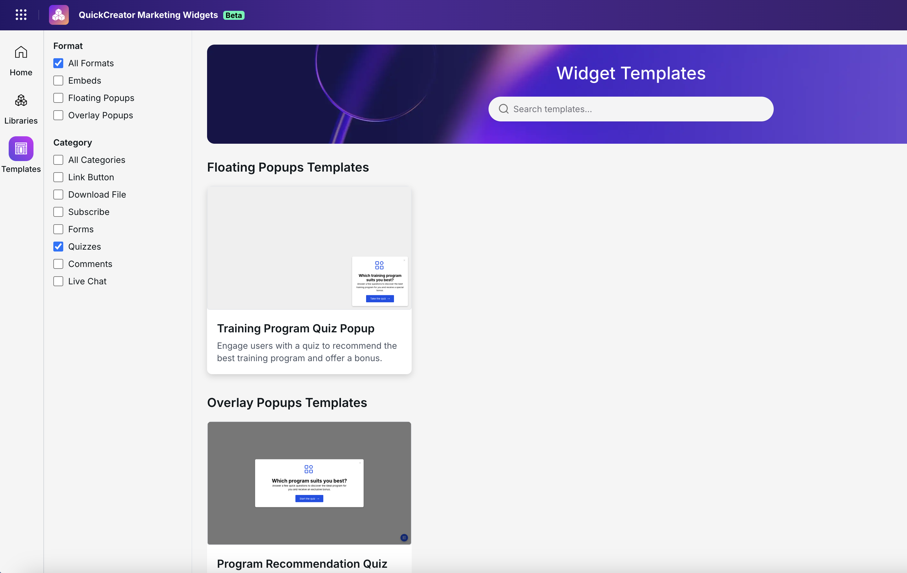
During the beta phase, QuickCreator offers 8 templates that you can customize to create different widget variations tailored to your needs. These templates cover use cases such as form-based data collection, file downloads, call-to-action prompts, and surveys.
Widget Use Cases and Configuration
CTA
Applicable Scenarios
Drive product or service trials and purchases by using CTAs like “Try Now”,“Free Trial” or “Buy Now” to guide users to experience the product or complete their purchase. This is especially suitable for SaaS products, e-commerce platforms, and similar businesses.
Creation and Configuration
Find the embedded CTA in the template library:
Use This Template:
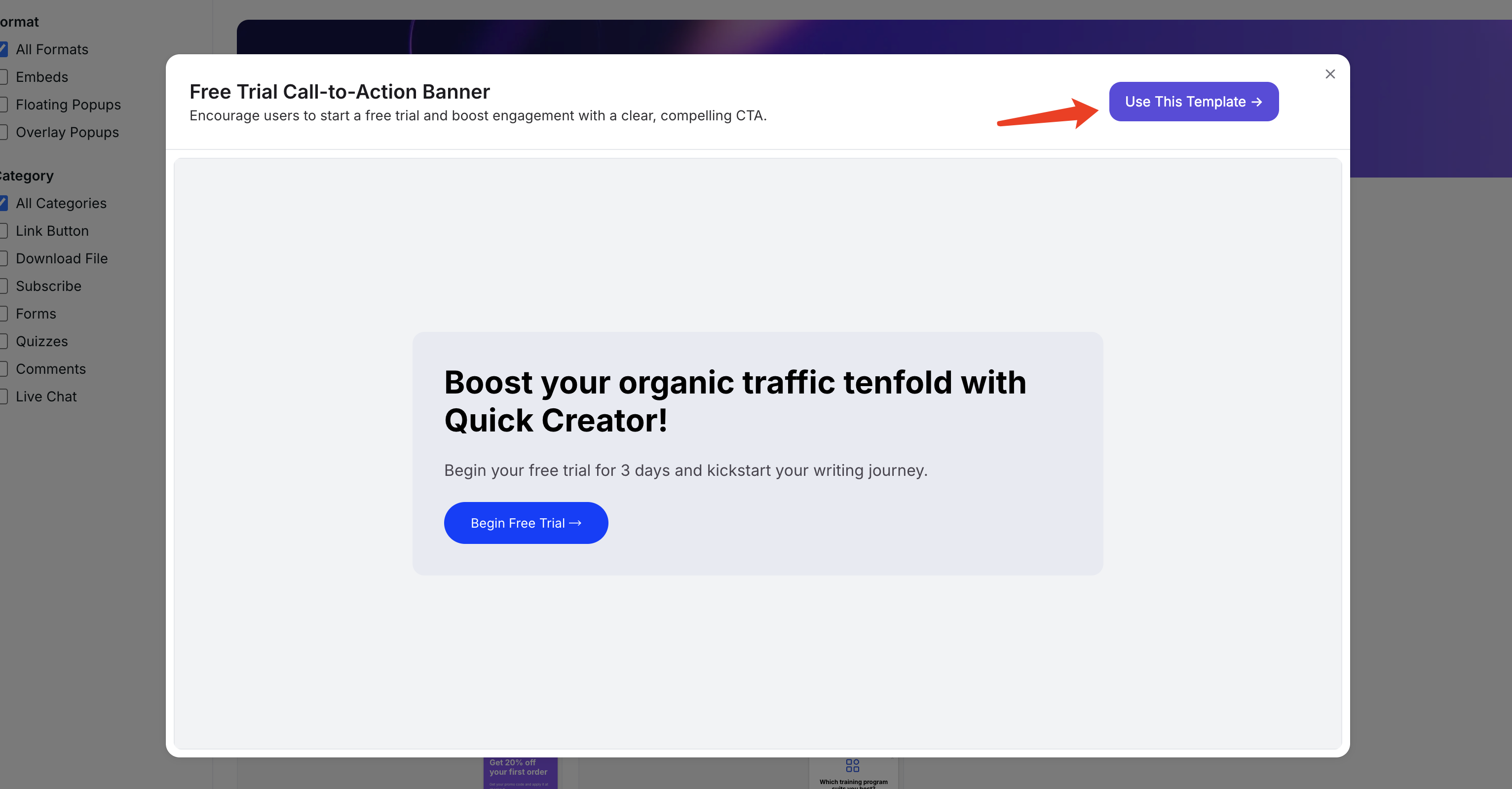
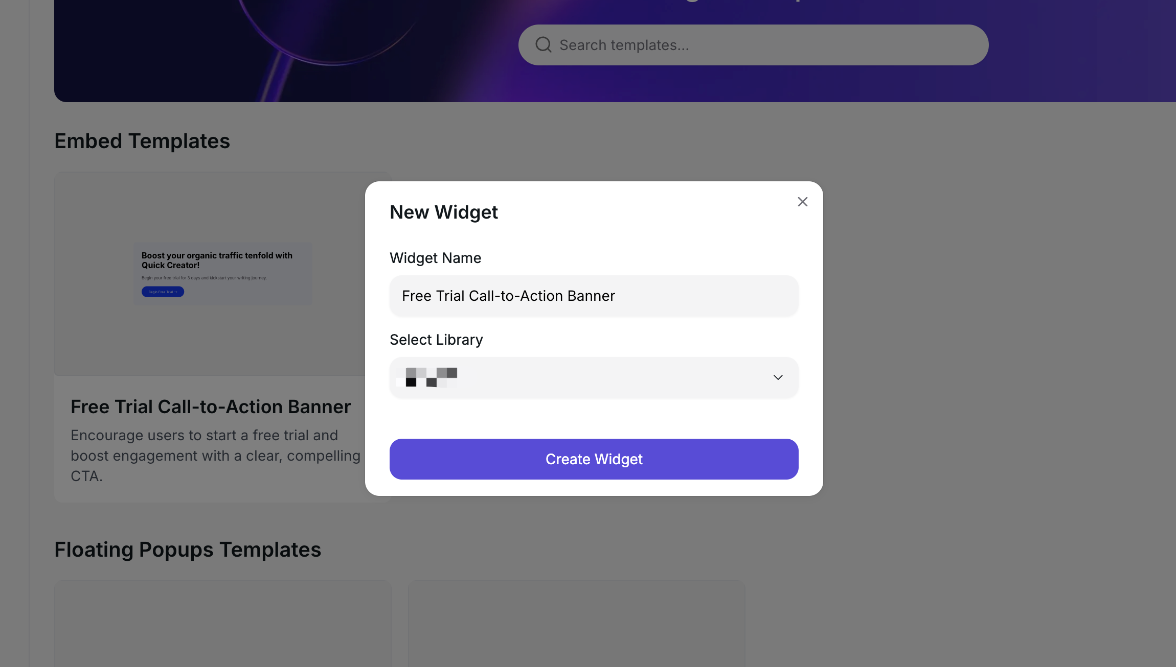
Name this new CTA widget and choose its library:
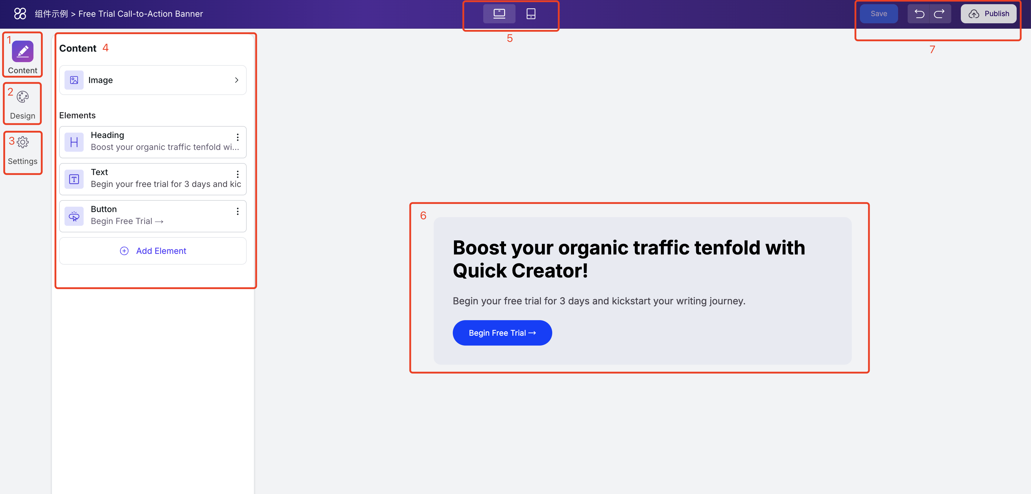
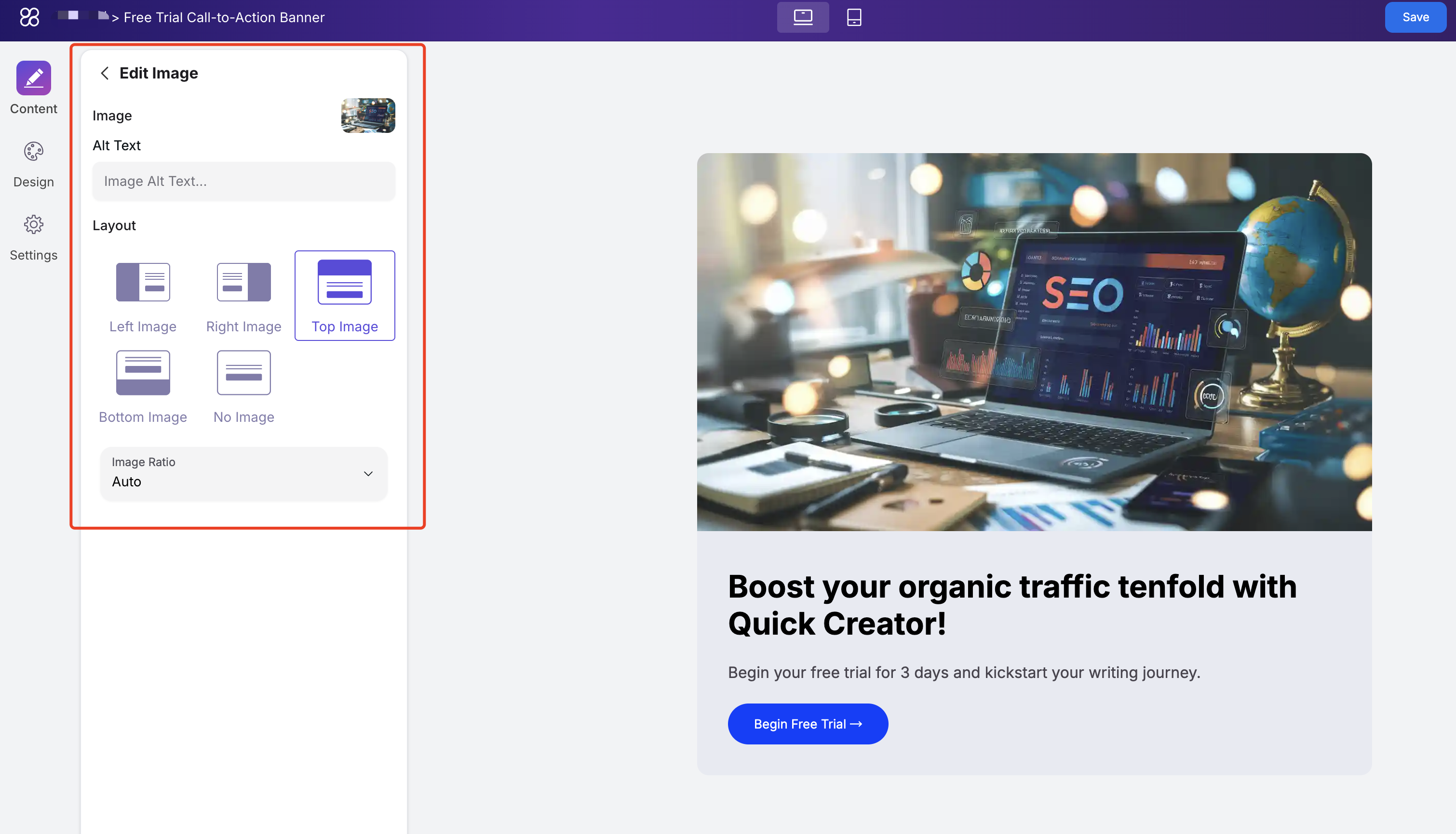
After entering the widget configuration page, you’ll see the following:
- The Content section in the left menu lets you edit elements like images, text, buttons, and forms within the widget.
- In Design, you can freely adjust styles such as theme colors, text colors, backgrounds, and layout.
- The Settings section allows you to control when the widget appears, how often it shows, and the time intervals between appearances.
- The configurable options for the selected menu will be displayed here.
- The device toggle at the top lets you switch between desktop and mobile views anytime to preview the widget’s appearance.
- The large area on the right displays the widget, allowing you to see real-time updates as you make changes.
- In the top-right corner, you’ll find buttons to save, undo edits, and publish. Only published widgets will be visible online.
Edit Content
In the example CTA widget, you can upload images, edit the title and text, and control the button’s label and click actions.
Add Image:
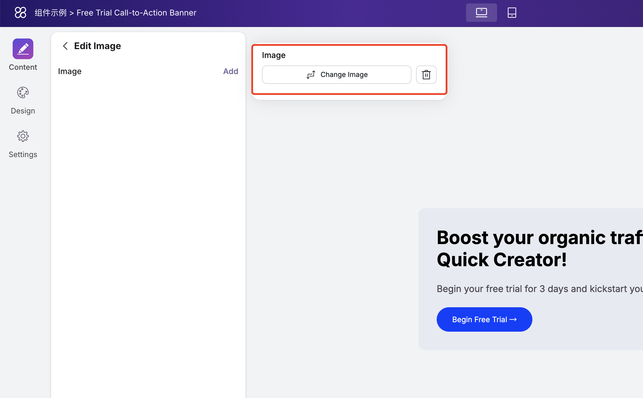
After successfully uploading an image, you can add alternative text, adjust the image’s position, and set the display ratio.
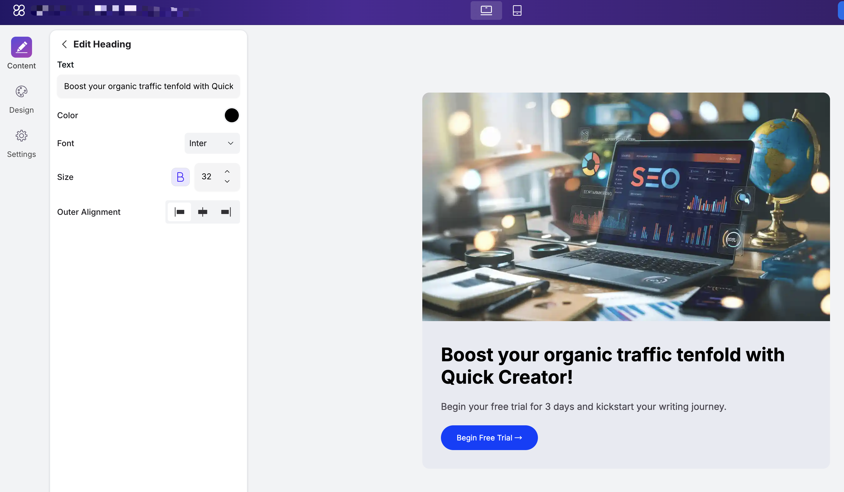
In the heading editing section, you can modify the content, text color, font, font size, and text alignment.
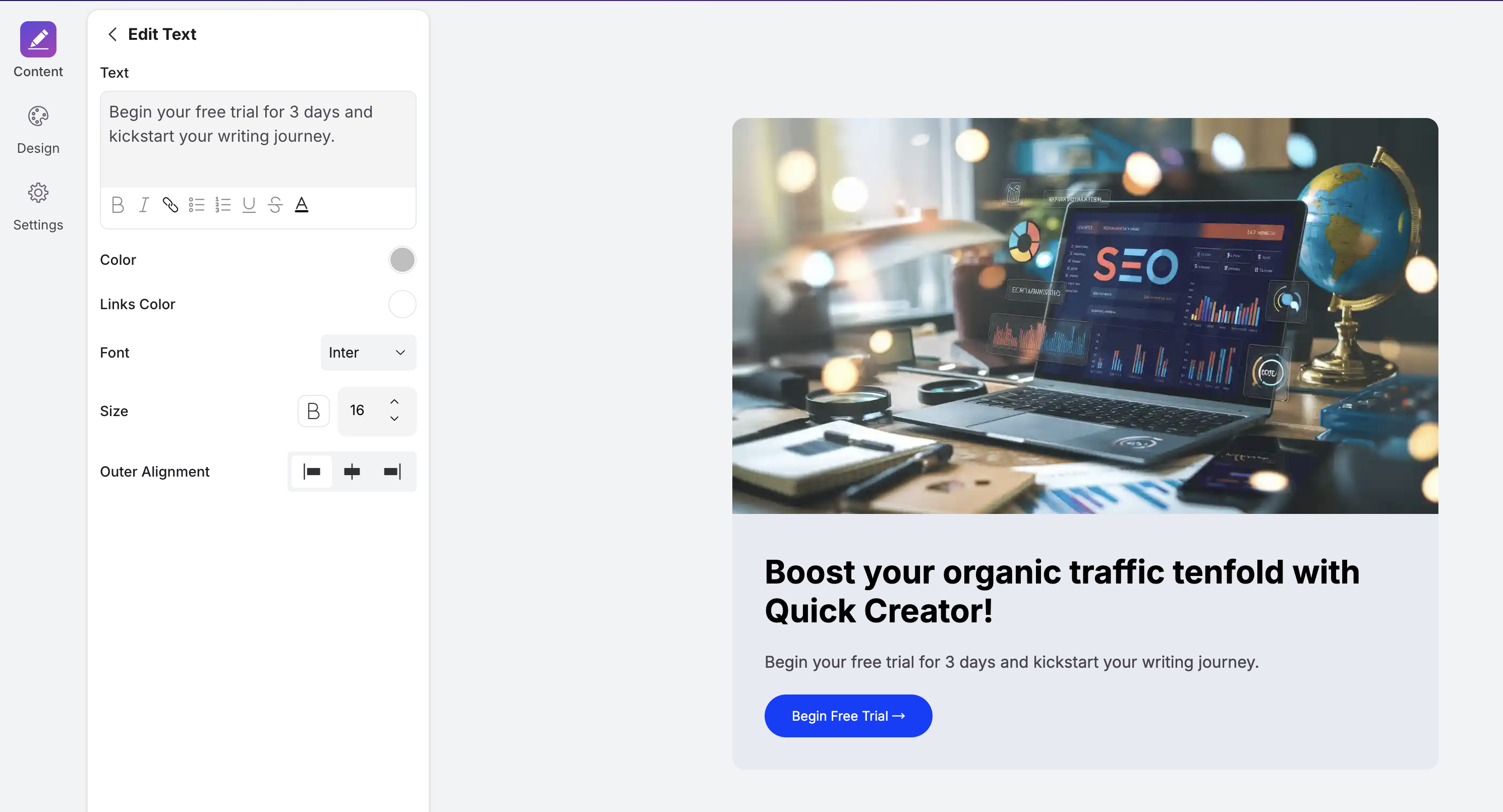
In the text editing section, besides modifying content and style, we also provide a rich text editor that allows you to adjust your content more flexibly—for example, you can apply different colors to different parts of the text and add links.
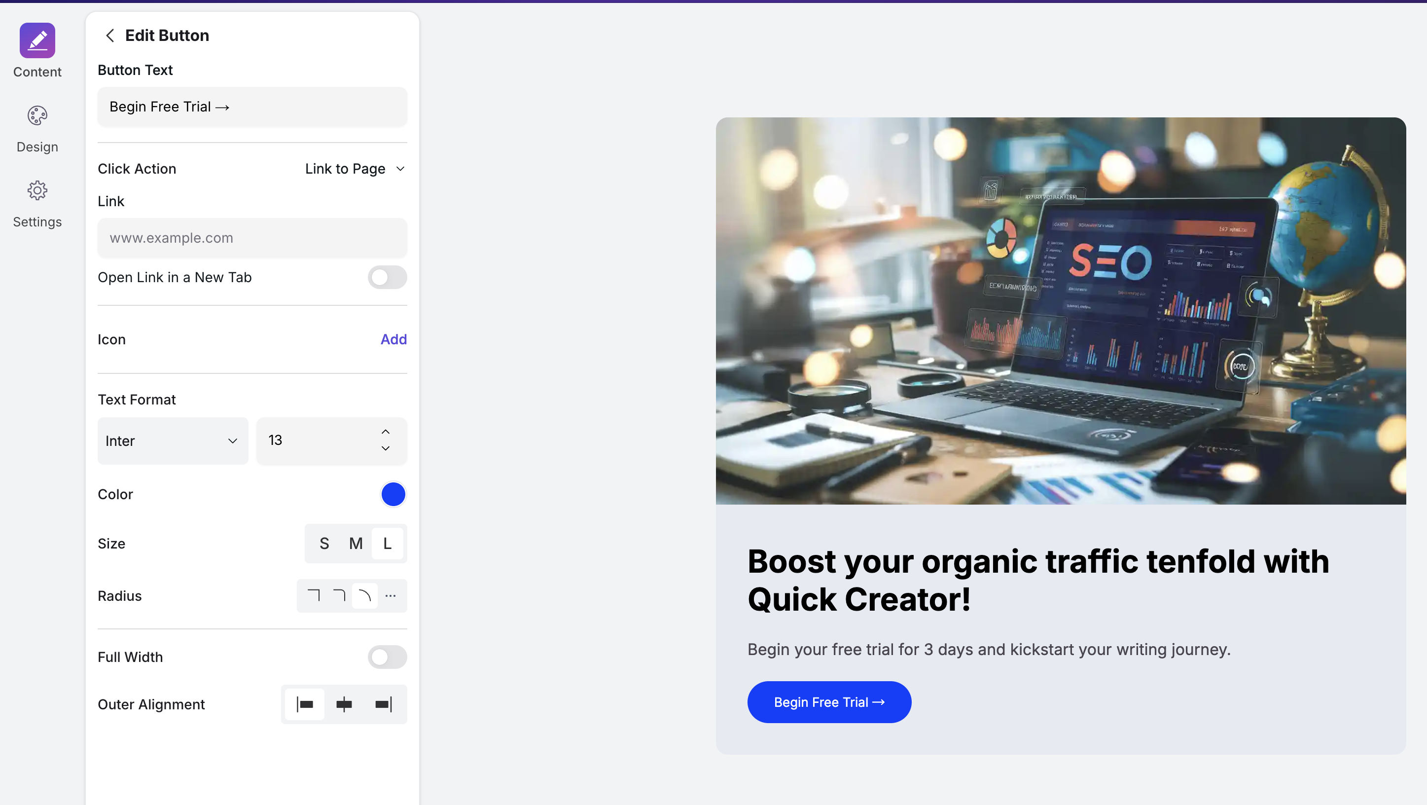
When editing the button, you can modify the button text, color, size, border radius, and also specify the button’s click behavior. There are three types of click actions:
- Link to a page: Specify the URL the button will navigate to when clicked.
- Close popup: If the current widget is a popup, you can configure the button to close the popup when clicked.
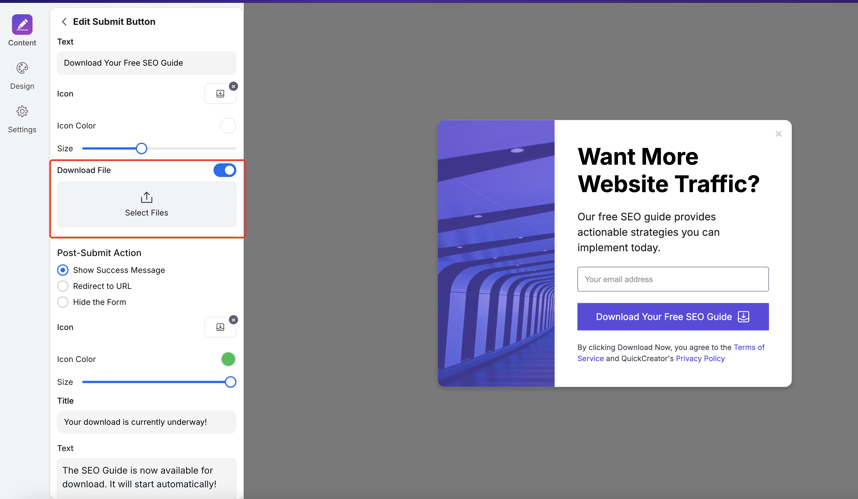
- Download file: You can upload a file, and clicking the button will download that file.
Form Widgets
Applicable Scenarios
Lead Generation and Customer Information Collection
By embedding forms on websites, landing pages, or blogs, businesses can collect user contact details and needs, generating sales leads that help sales teams follow up promptly.
Market Research and User Feedback Collection
Through surveys or questionnaires, companies can gather user opinions and suggestions about products, services, or brands to understand market demands and guide product improvements and marketing strategies.
E-commerce Orders and After-sales Service
On e-commerce platforms, forms can be used to collect order information, handle return or exchange requests, and manage after-sales service inquiries, improving customer satisfaction and service efficiency.
Content Subscription
Set up subscription forms to collect users’ email addresses for sending newsletters, promotional information, or personalized recommendations, enhancing user engagement and conversion rates.
Creation and Configuration
Filter by form types in the Template Library, where you can find examples that best fit your scenarios for creation and editing.
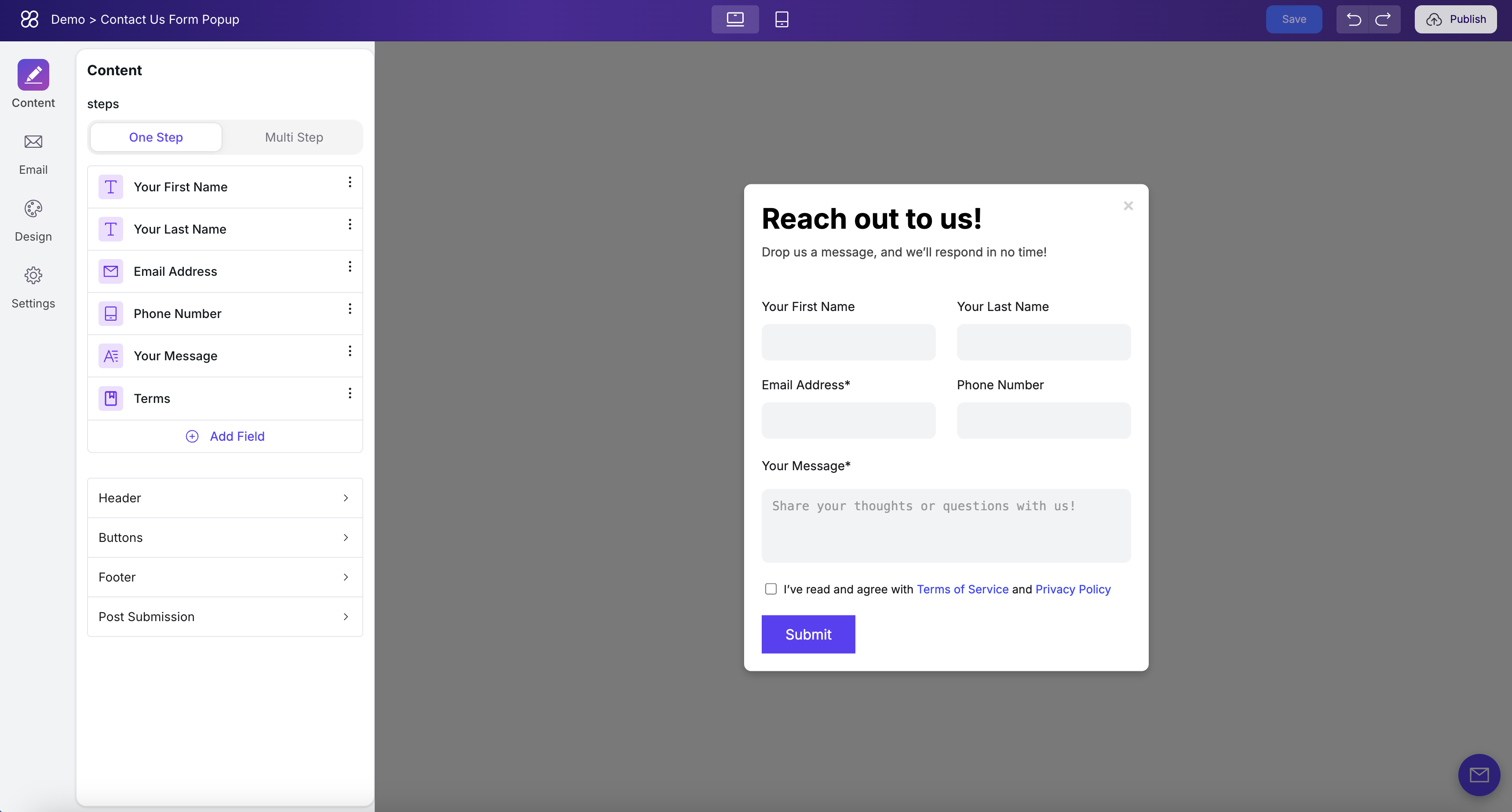
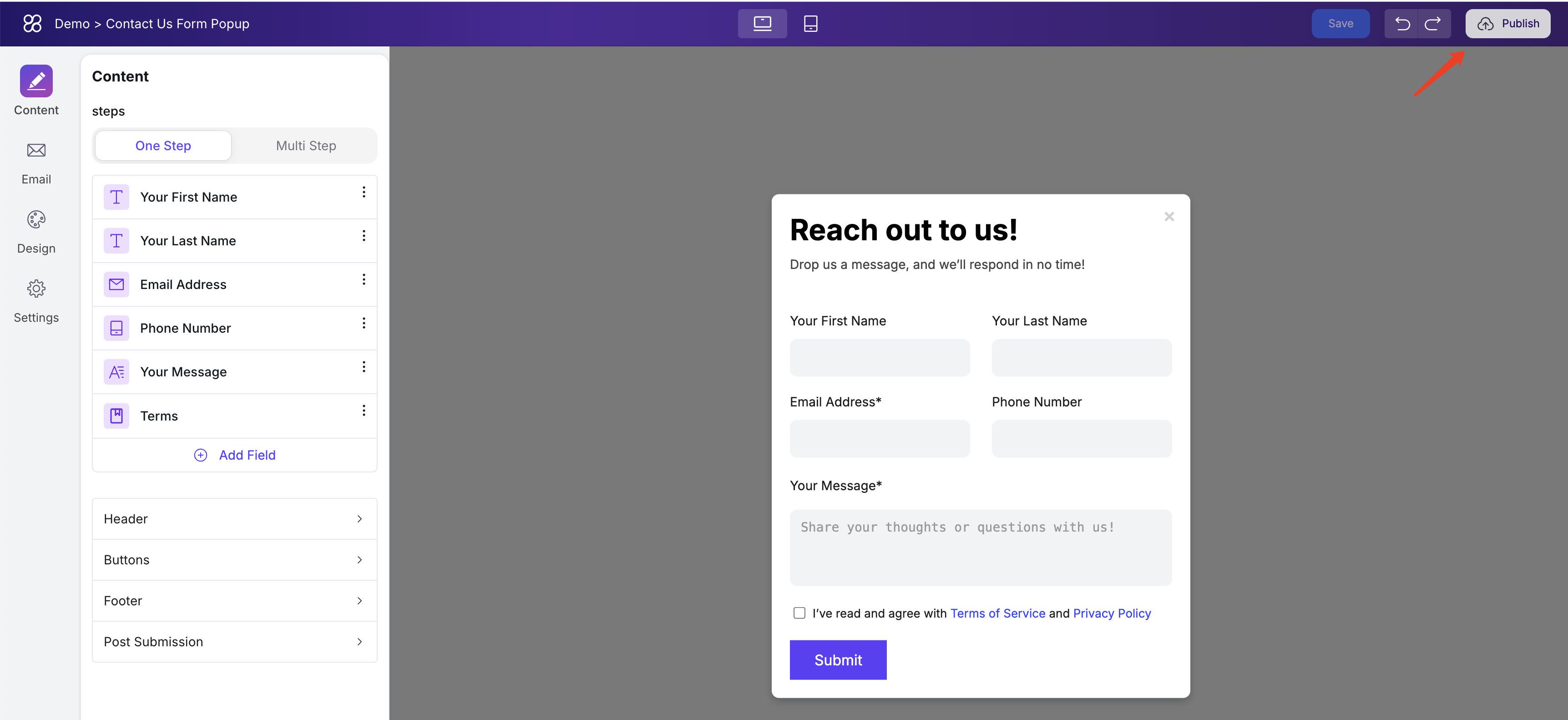
Let’s take the “Contact Us” form as an example:
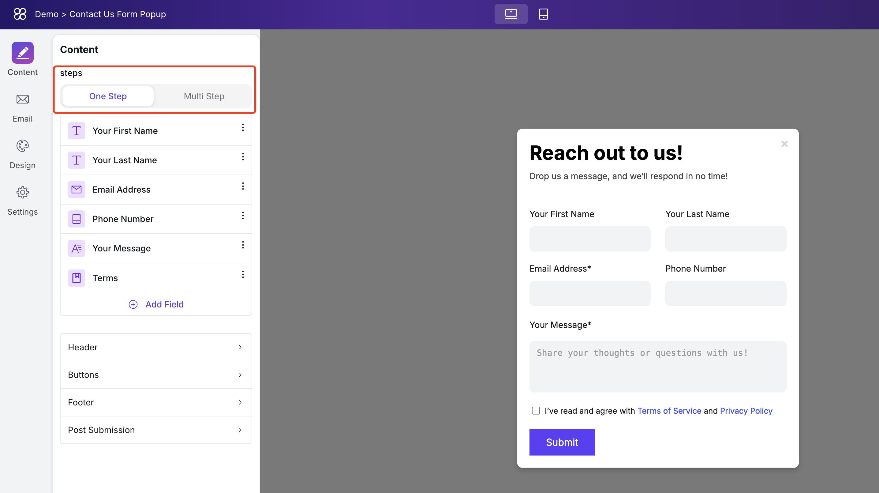
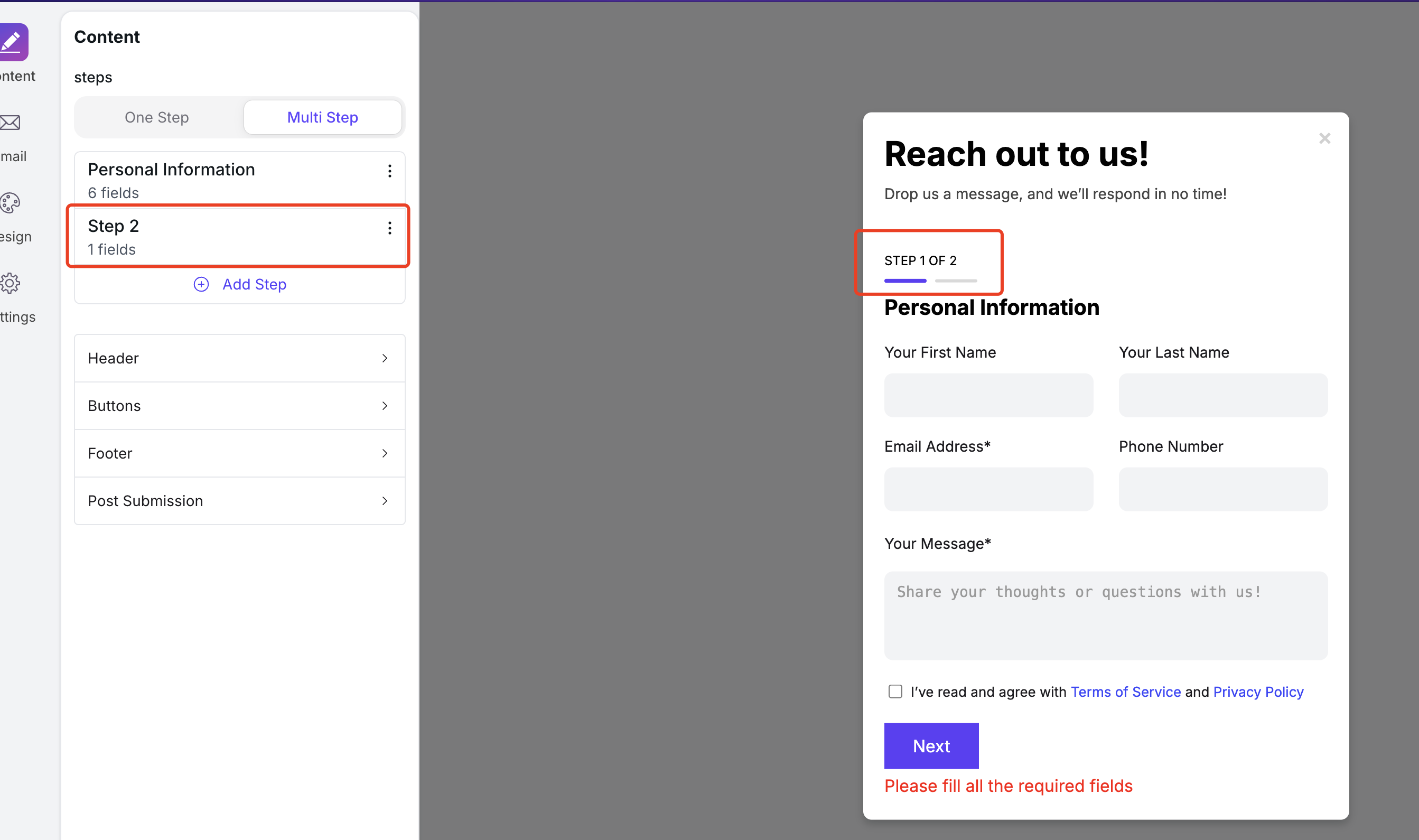
One-step vs. Multi-step Submission
In the Steps option, you can control whether the form is filled out in a one step or multiple steps. In one-step mode, all fields are displayed at once, and users submit the entire form after completing it.
In the multi-step configuration, you can split the required fields into multiple steps. This setup is suitable for forms with a lot of content or those that require multi-step validation.
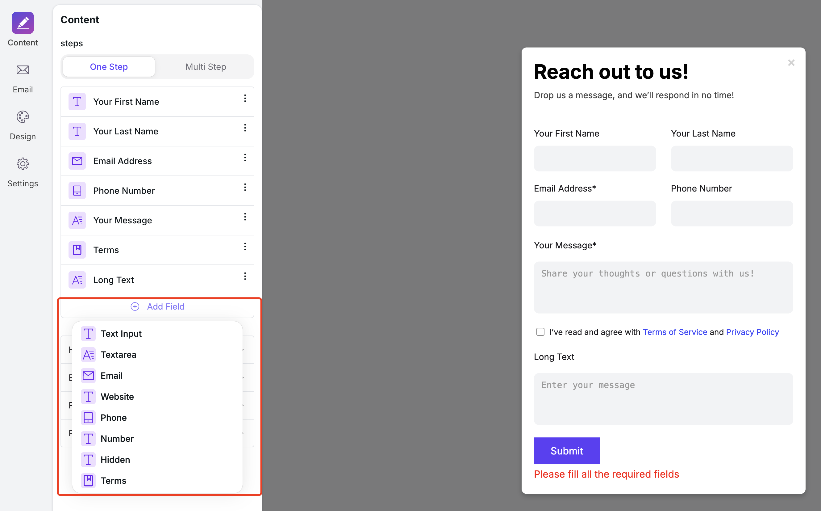
Field Types in Forms
The form supports 9 types of fields:
- Text Input: Small input box, usually for username, address, etc.
- Text Area: Large input box, generally used for longer text entries.
- Email: Email address field that validates the format to prevent errors.
- Website: URL field that checks the format to avoid mistakes.
- Phone: Phone number field with format validation.
- Number: Numeric field that doesn’t allow text input and validates the format.
- Hidden: Rarely used; for submitting data that users shouldn’t see but needs to be included with the form.
- Terms: Checkbox mainly used for agreeing to terms and conditions.
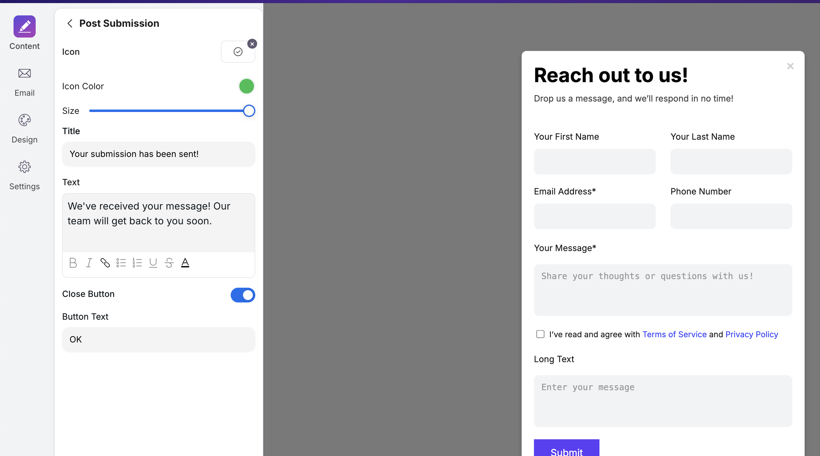
Post-Submission Display
You can configure the thank-you message shown after a successful form submission in the Post Submission settings.
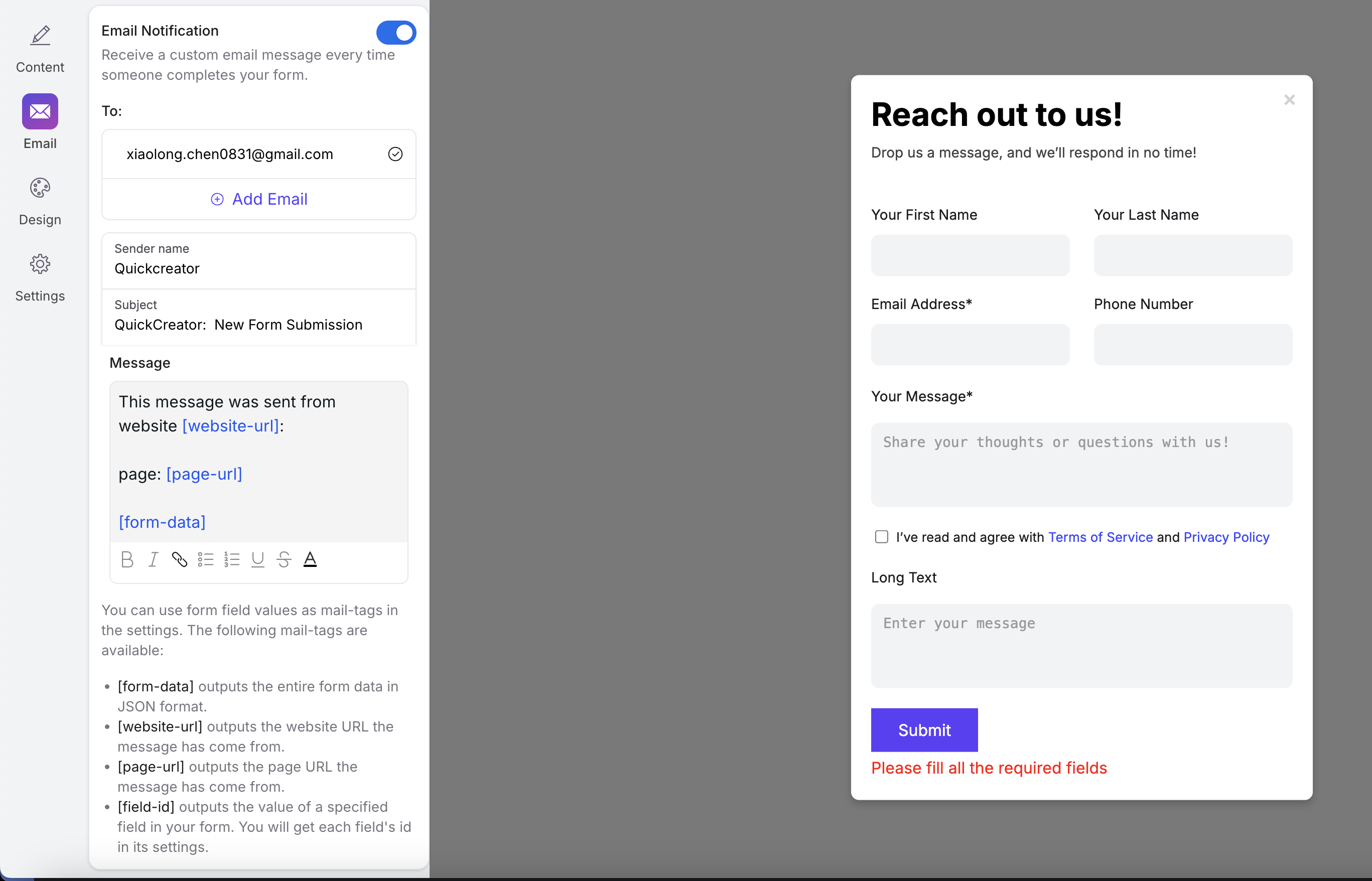
Configure Email Notifications
In the email settings, you can specify a list of email addresses to receive form submissions. When a lead submits your form, the detailed form content will be sent to these email addresses.
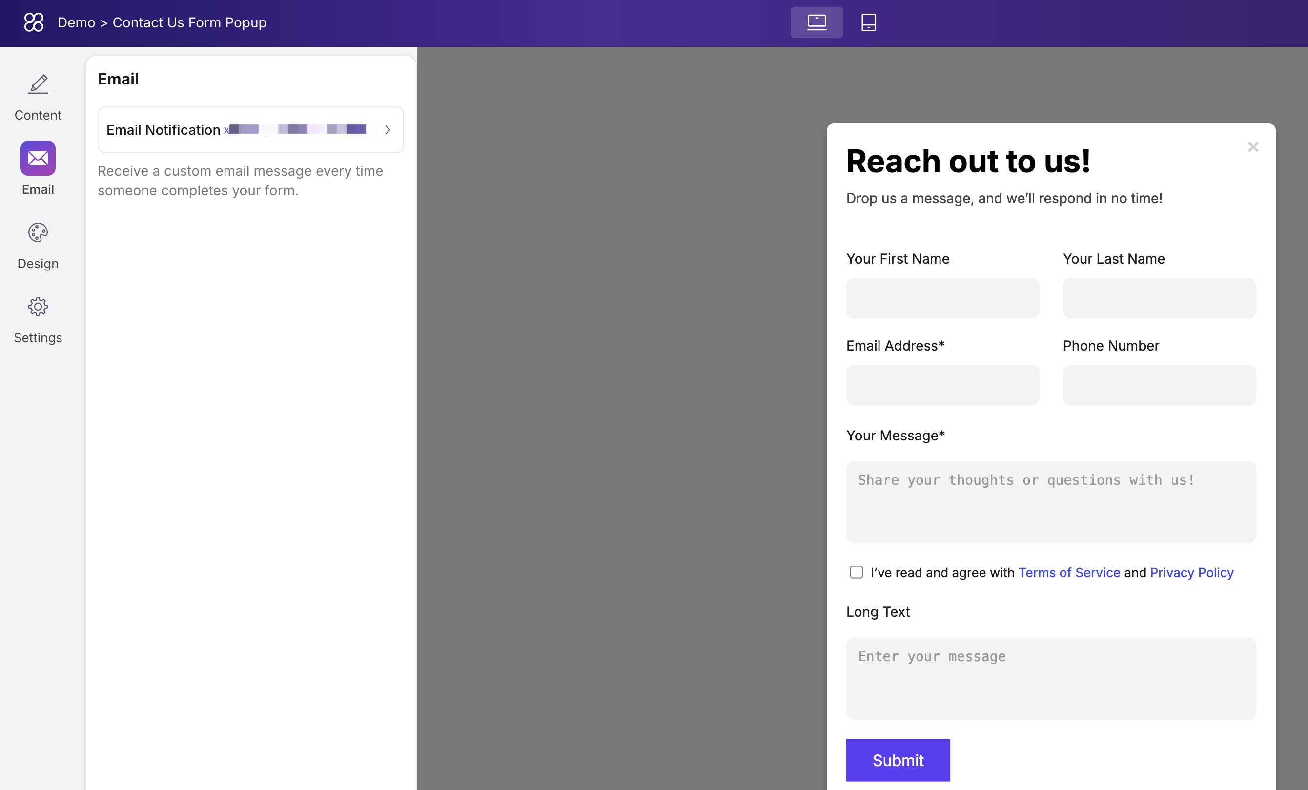
The form fields supported in the email content are detailed in the configuration settings, where you can find more specific explanations.
File Download
Applicable Scenarios
Embedding CTA buttons like “Download Whitepaper,” “Download Full Guide,” or “Download Industry Report” on websites, blogs, or landing pages can effectively encourage visitors to fill out forms, collect lead information, and build a sales pipeline.
Creation and Configuration
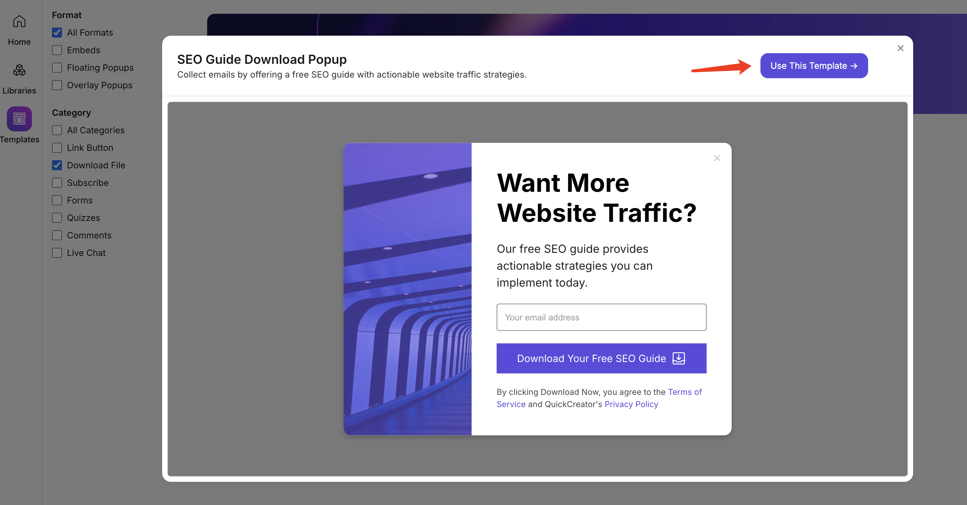
In the Templates, you can filter by the category “File Download” to find pre-built file download templates.
Use this template:
Most of the widget’s configuration options are similar to those in the CTA section, so you can refer to that directly.
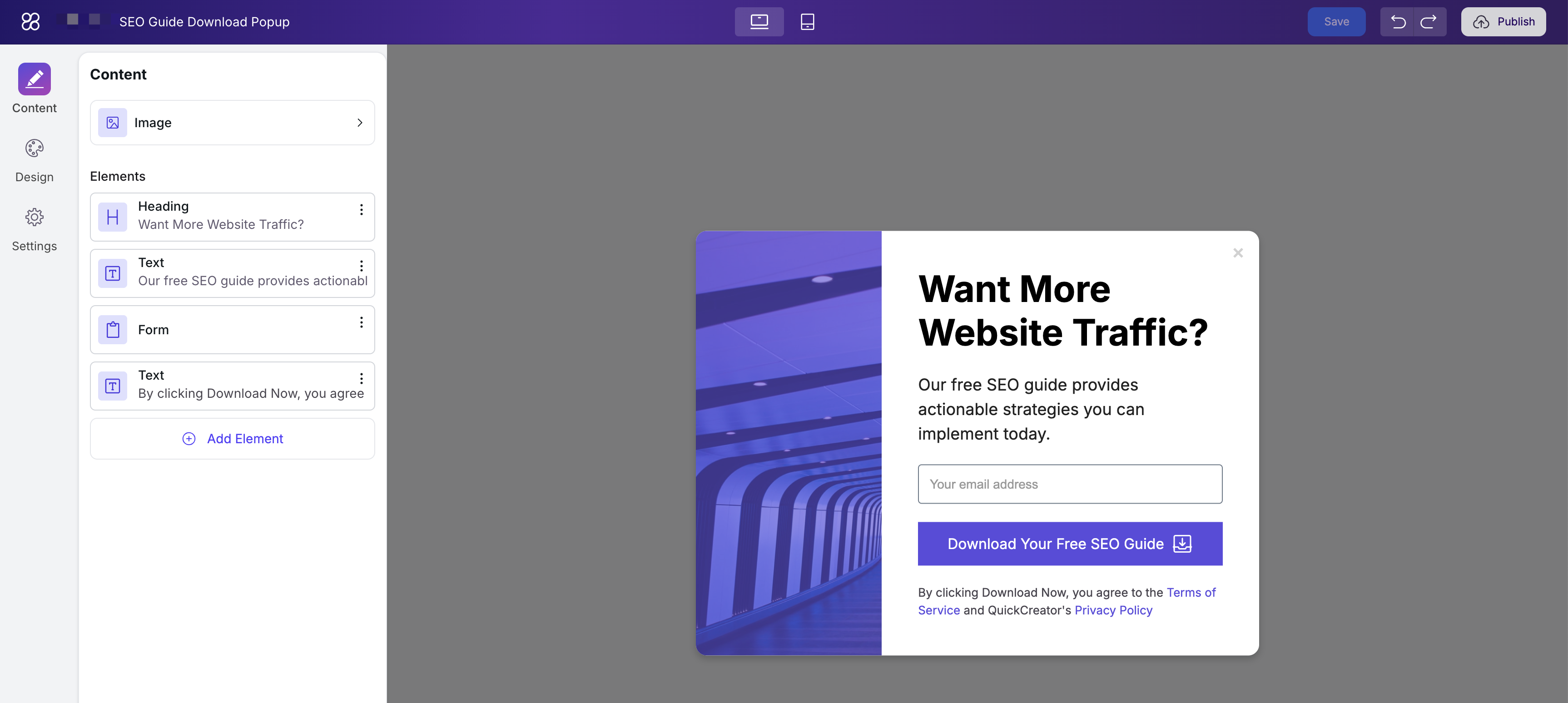
This template not only provides file download functionality but also includes form data collection. When users fill out the form fields and click the button, their information is collected before the file download begins. You can click on the “Form” section within the content to view its configuration.
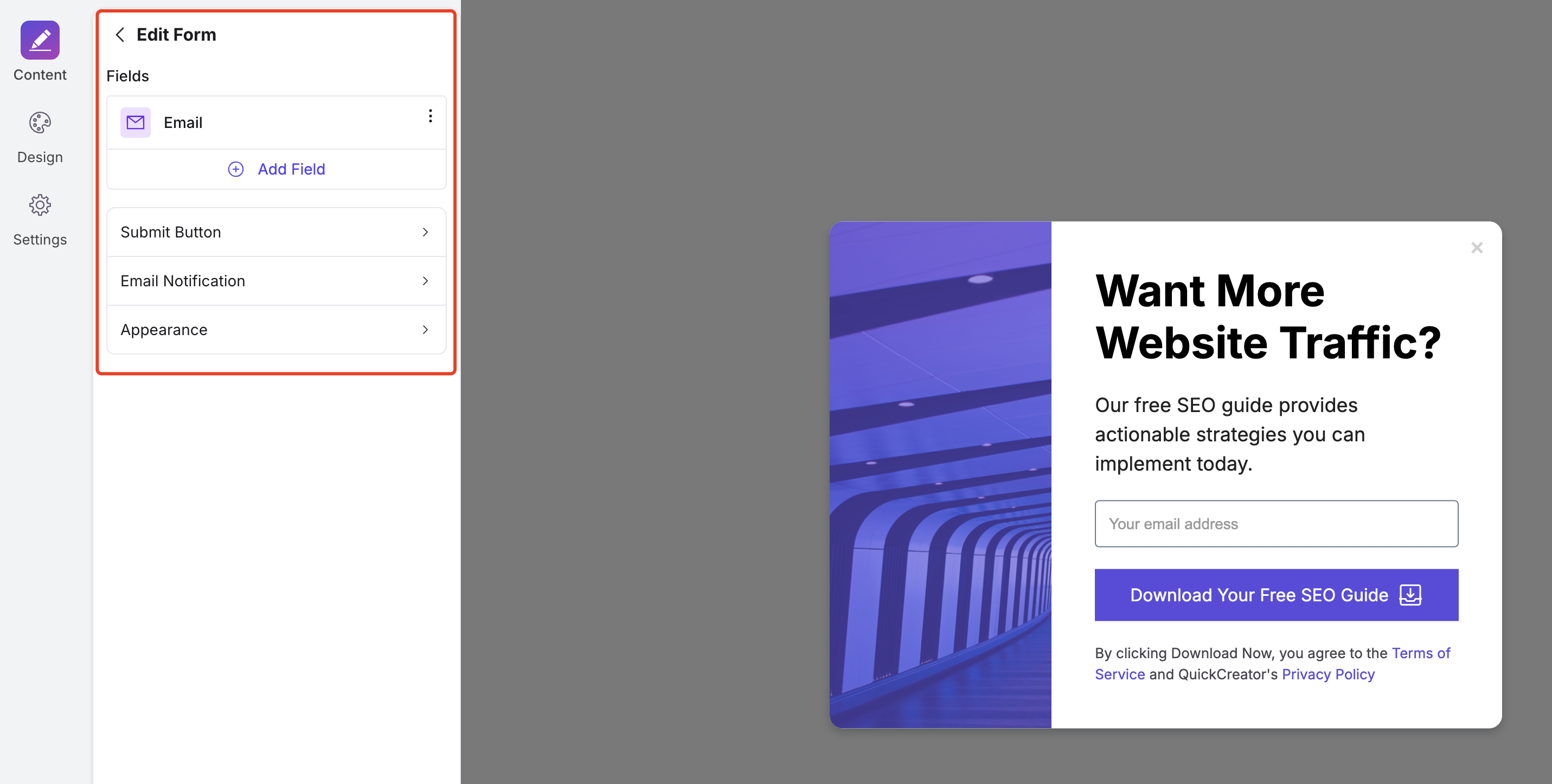
You can refer to the Form Widgets introduction chapter for detailed information on form configuration. For file downloads, simply click the “Submit Button” and then upload the file at the location shown in the image below:
Quizzes
Applicable Scenarios
Survey widgets are an effective user engagement tool in digital marketing, suitable for multiple key scenarios. They help businesses collect data, gain insights into user needs, and optimize marketing strategies.
Customer Satisfaction and Service Quality Evaluation
By embedding surveys on websites, businesses can understand customer satisfaction with products, services, or support experiences. This feedback helps identify areas for improvement, boosting customer loyalty and repeat purchases.
Event Feedback and Increasing User Engagement
After promotions, webinars, or trade shows, surveys can be used to collect participant feedback, assess event effectiveness, and enhance user engagement and satisfaction through personalized follow-up marketing.
Content Preference Surveys and Personalized Recommendations
Surveys help identify user preferences for content topics and styles. Businesses can then optimize their content strategies to deliver content that better matches user interests, increasing user retention.
User Experience and Product Feature Optimization
During product iterations, gathering user feedback on features, interfaces, or workflows helps identify issues, improve user experience, and enhance product competitiveness.
Creation and Configuration
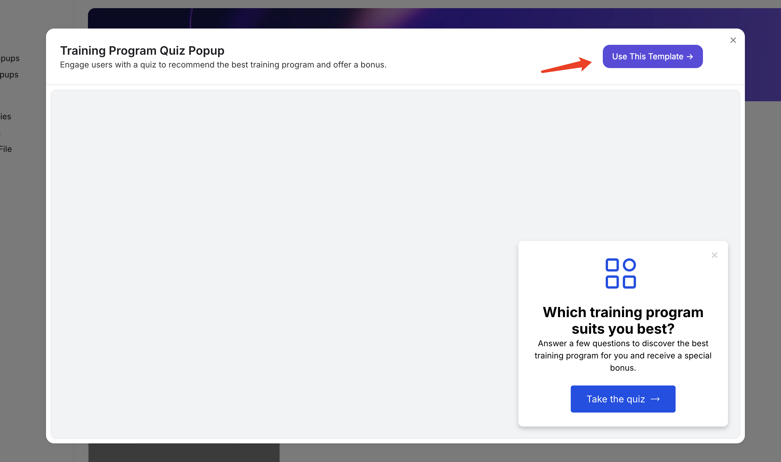
In the Template Library, filter by the survey category to start building from a best-practice example.
Use this template:
In the configuration of Quizzes, in addition to the usual style and text settings, you also need to pay attention to the configuration of the questions and the test results:
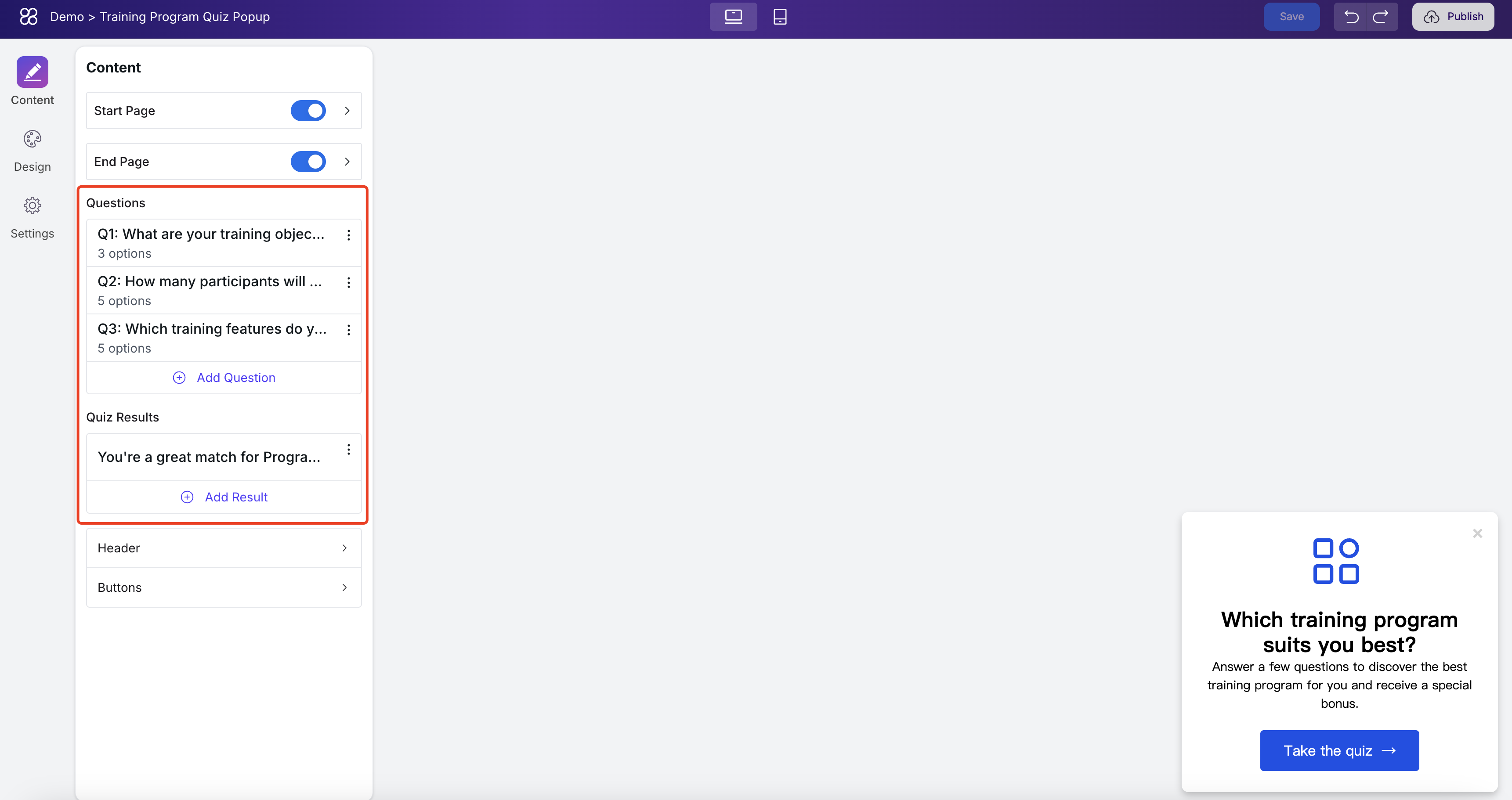
Configuration of the questions
In the questions, you can control the number of questions, their content, and the options. The options can be either single-choice or multiple-choice:
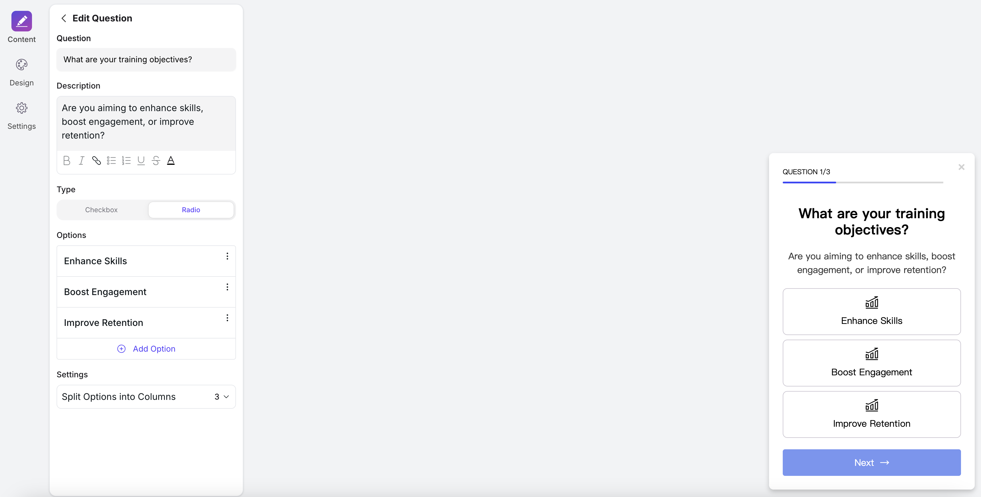
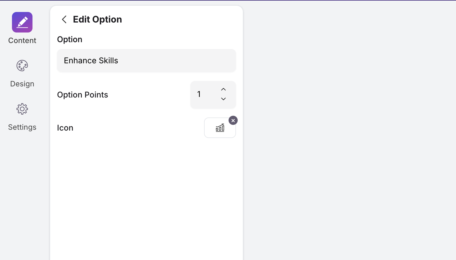
Each option includes the following configurations as shown in the image:
- Option: the text content;
- Option Points: you can think of this as the “score” — if a user selects this option, they will receive that many points. The total score from all questions will lead to different test results;
- Icon: the icon on the option, which can also be removed;
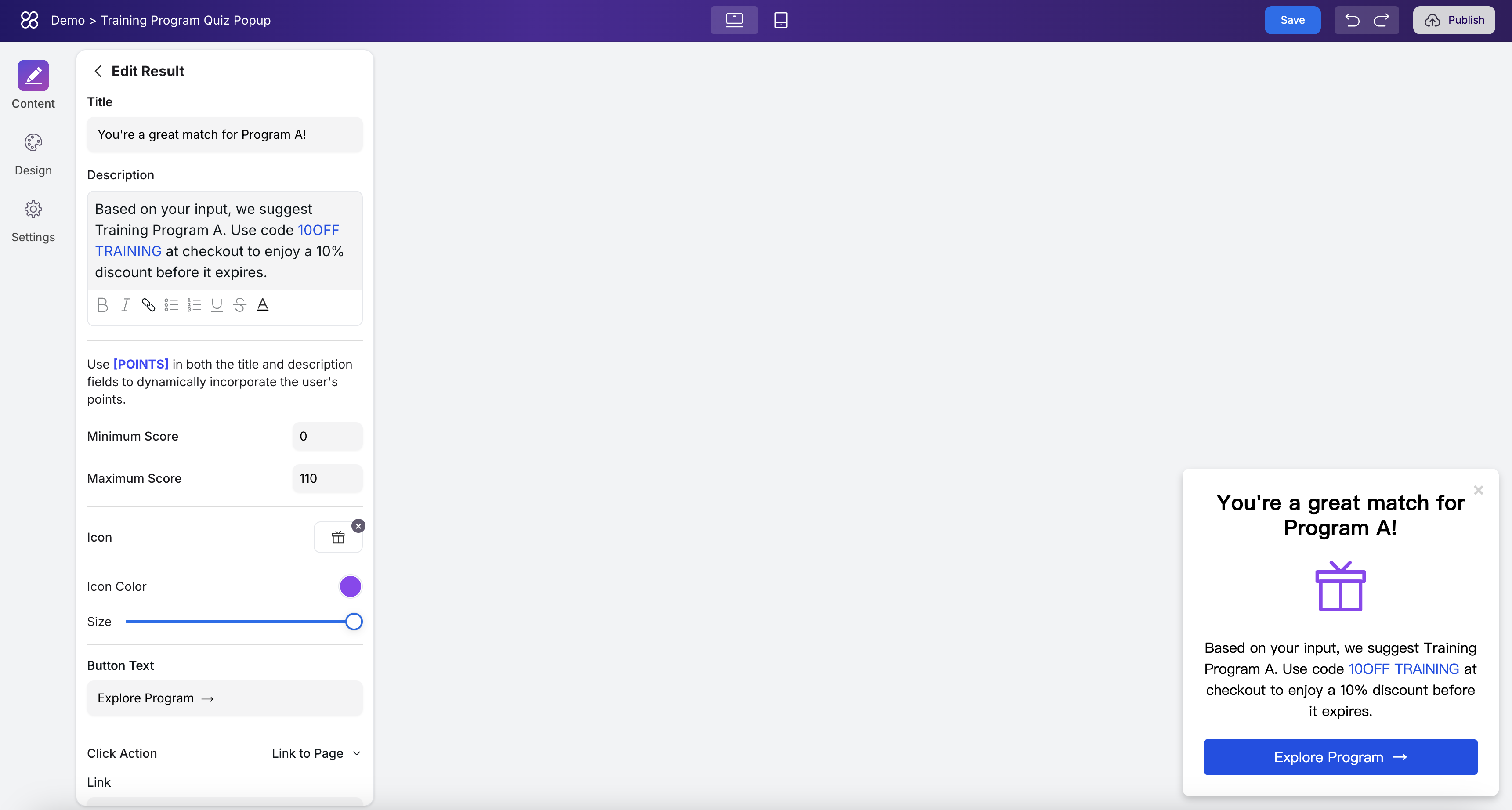
Configuration of Quiz Results
You can add multiple different results to the Quiz. Each result includes the following display elements: a title, description, icon, a call-to-action button, and the score range that will trigger this result.
You can imagine a questionnaire scenario with three questions: Question A, Question B, and Question C. The options are as follows:
Question A options:
- A1 (score: 5)
- A2 (score: 10)
Question B options:
- B1 (score: 5)
- B2 (score: 10)
- B3 (score: 15)
Question C options:
- C1 (score: 5)
- C2 (score: 10)
There are two possible results for this quiz:
- Result A: score range 15–20
- Result B: score range 25–35
This setup allows you to map different combinations of answers to different quiz outcomes.
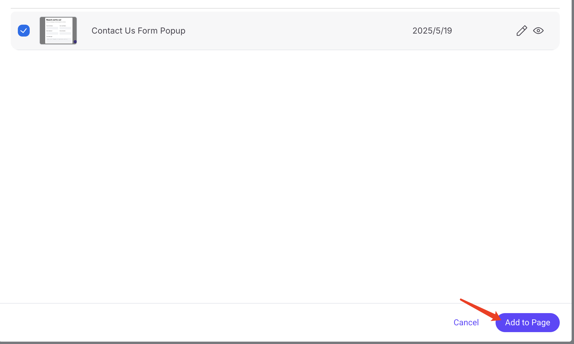
How to Embed the Component into posts
Once you’ve finished editing the component, you can publish it by clicking the "Publish" button in the top right corner.
After publishing, you can go back to any blog post and insert the marketing widget at the appropriate position:
A dialog will pop up for selecting a component. Find the one you want to add, then click “Add to Page” in the bottom right corner. After adding it, you’ll need to republish the article:
FAQ
Will the widgets created during the Beta phase be deleted after the official product launch?
No, we will keep the widgets you created during the Beta phase. Any content you've embedded will continue to display normally.
Will content published to WordPress, Shopify, or other platforms display correctly?
Yes, it will display correctly. The marketing widgets render independently of the platform, as long as the platform supports embedding HTML code. The widget styles are self-contained and won’t be affected by the external platform’s styling.